Project Description
CHOICE HOTELS REBRAND
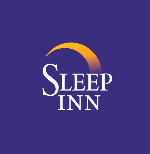
BEFORE
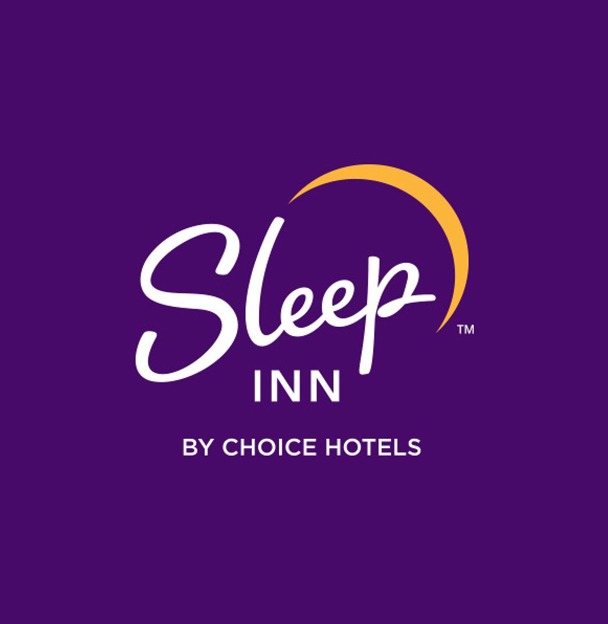
AFTER
SLEEP INN
BRIEF
nm+u was tasked with creating a new logo and brand identity for “Sleep Inn” that leverages Sleep Inn’s value proposition as a new-build hard spec brand. The existing logo did not reflect the stylish and design-oriented interiors.
SOLUTION
The team leveraged the “moon” icon from the original logo, but made it more modern by finishing the arc and making it a single color. The custom script font is heavy enough to be read at a distance, and created in a wistful, hand-written style to invoke an inviting, relaxed, free feeling. The corners are capped as written with a marker-style pen which subtly nods to a casual nature. All of this is consistent with the brand’s relaxed, natural, calming interior vibe and value proposition.
BEFORE
AFTER
CLARION HOTEL
BRIEF
nm+u was tasked with developing a new brand logo and brand identity for Clarion with emphasis on elevating and modernizing the brand.
SOLUTION
Created in conjunction with the Clarion Pointe brand, the new Clarion Hotel logo utilizes its original icon to retain consistency, yet updates the font to be a more modern san-serif to make it more modern and in line with its recent branding update. The Clarion Hotel and Clarion Pointe logo typography both utilize the same fonts, to show alignment, but one is capitalized while the other is used in lower-case to show the Parent/Child relationship.
BEFORE
AFTER
QUALITY INN
BRIEF
nm+u was tasked with creating a new logo and brand identity for “Quality Inn” that leverages specifically Quality’s extensive brand awareness and rich brand history.
SOLUTION
The Quality Inn Logo was created to be modern with a nod to the traditional. The original logo had a pronounced descender in the “Q” icon and that was respected in the new icon. It was also brought out of the curved square shape to not be “cut off” and to retain it’s full shape. While the original icon was very ornate and golden, this new iteration is a modern take on that traditional execution. The typography was custom created to blend traditional features with a contemporary base.
BEFORE
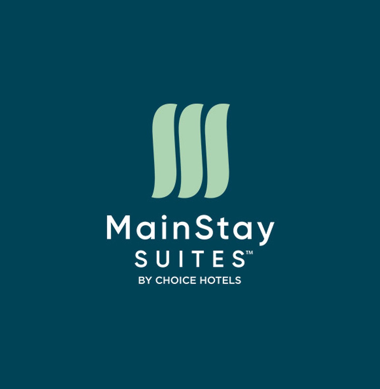
AFTER
MAINSTAY SUITES
BRIEF
nm+u was tasked with creating a new logo and brand identity for Mainstay Suites with emphasis on modernizing the brand while communicating its value proposition as an extended-stay brand.
SOLUTION
The Mainstay Suites logo was created to invoke a sense of the nautical themes that originating from the previous logo. The triple wave icon represent the sea, or the wind, or three sails, helping you navigate the complexities of daily life or travel, while also in a trifecta, representing stability throughout those “storms.” The triple wave icon also is created to be an “M” made out of three “S” letters as in the logo’s monogram.


