Project Description
Project Description
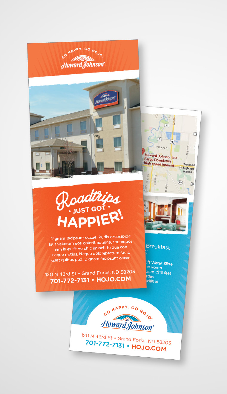
Howard Johnson, an established economy hotel chain with over 400 properties around the world, tapped nm+u to undertake a comprehensive visual refresh to better align its “Happy” positioning with its original roots and heritage as a roadside hotel brand while elevating the overall sophistication of the brand.
Approach:
The agency conducted a comprehensive discovery exercise to identify key elements from Howard Johnson’s heritage and value proposition as well as opportunities for differentiation within the competitive set.
Outcome:
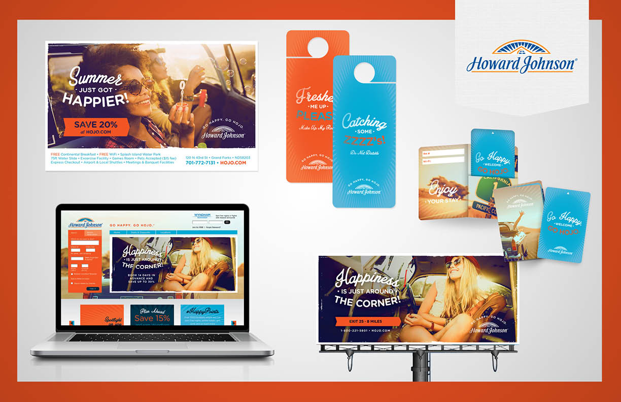
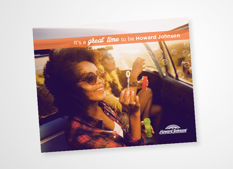
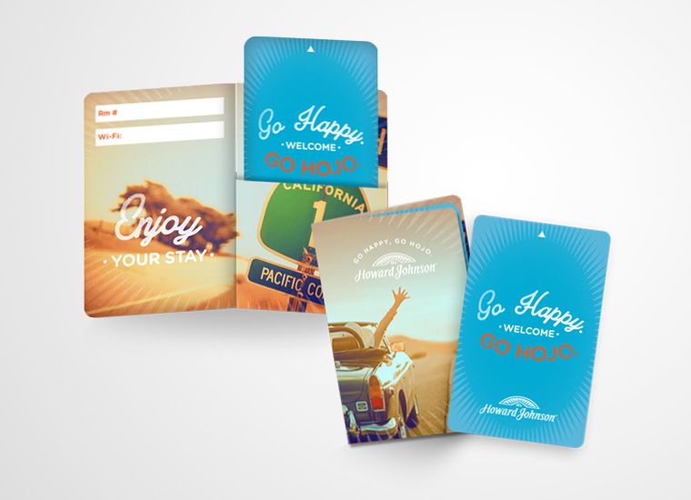
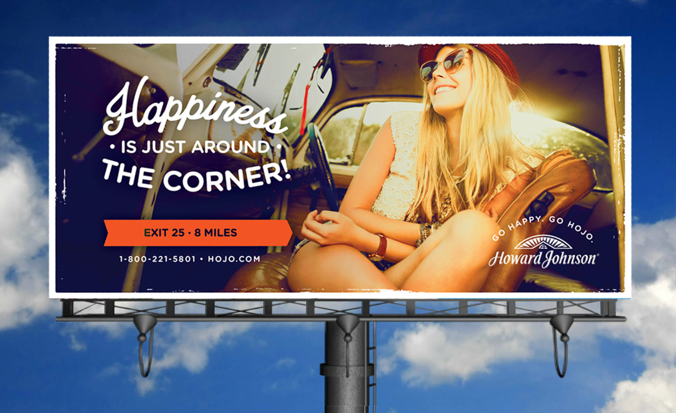
- The new Howard Johnson brand feels true to itself, is contemporary and sophisticated while still appealing to the road traveler.
- The brand’s blue and orange color palette was leveraged in order to maintain the “happy” attribute of its positioning.
- A unique visual style was developed using elements that pay homage to the brand heritage.
Deliverables Included:
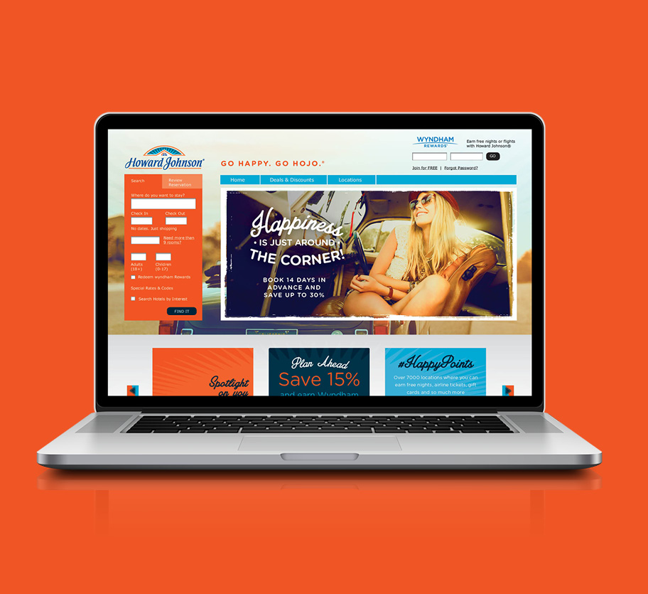
- Overall brand look and feel
- Comprehensive advertising template library: print and digital
- New website user interface re-skin
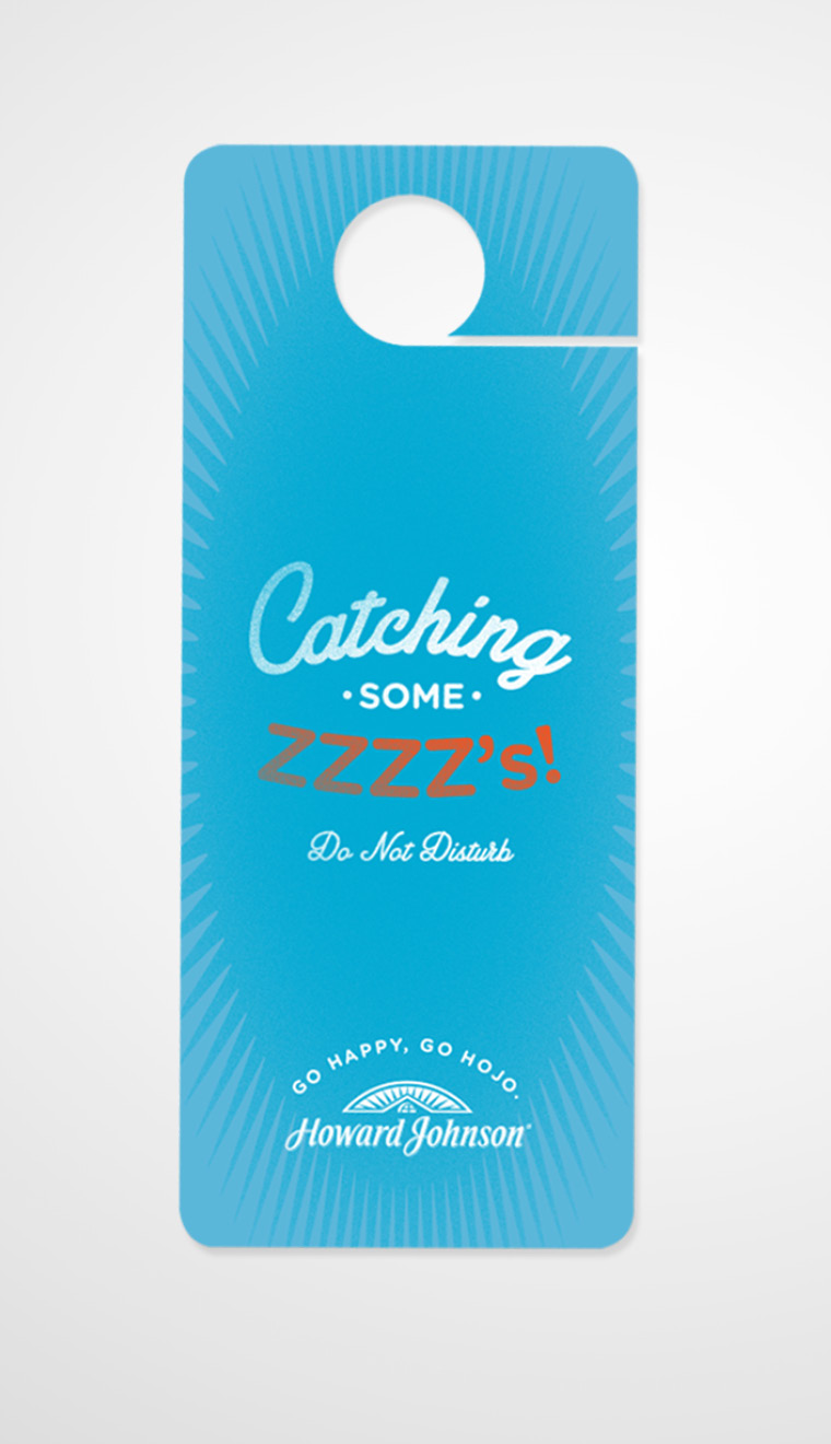
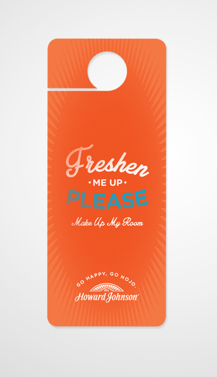
- Comprehensive in-house collateral materials library
Conceptual Design Samples
See similar pieces
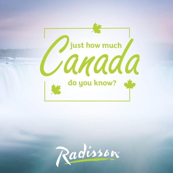
Radisson: Discover Canada Campaign
RADISSON: DISCOVER CANADA CAMPAIGN BRIEF Radisson Hotels and Resorts was looking for a fun and engaging way to provide additional marketing support to their Canadian properties and increase bookings with their quarterly offer. CHALLENGE With around 20 properties spread over several territories, the challenge was [...]
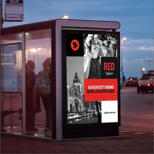
Traditional Marketing:
Out of Home
TRADITIONAL MARKETING: OUT OF HOME + RADISSON RED: CAMPAIGN LAUNCH OUT OF HOME + IHOP FRESH & GO: LAUNCH OUT OF HOME MATERIALS + BETTER HOMES AND GARDENS MAGAZINE: EXPECT BETTER SPREAD + IHOP: PANCAKE [...]
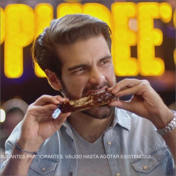
Traditional Marketing:
Commercials
TRADITIONAL MARKETING: COMMERCIALS + HAWTHORN BY WYNDHAM: WE THE TRAVELERS COMMERCIAL Shot over 2 days in the newest Hawthorn Suites by Wyndham prototype, NM+U worked with a production crew, stylists, hair and makeup, and 12 talent to create a fun and sometimes cute way of showing off [...]