Project Description

CLARION® BY CHOICE HOTELS:
BRANDING
BRIEF
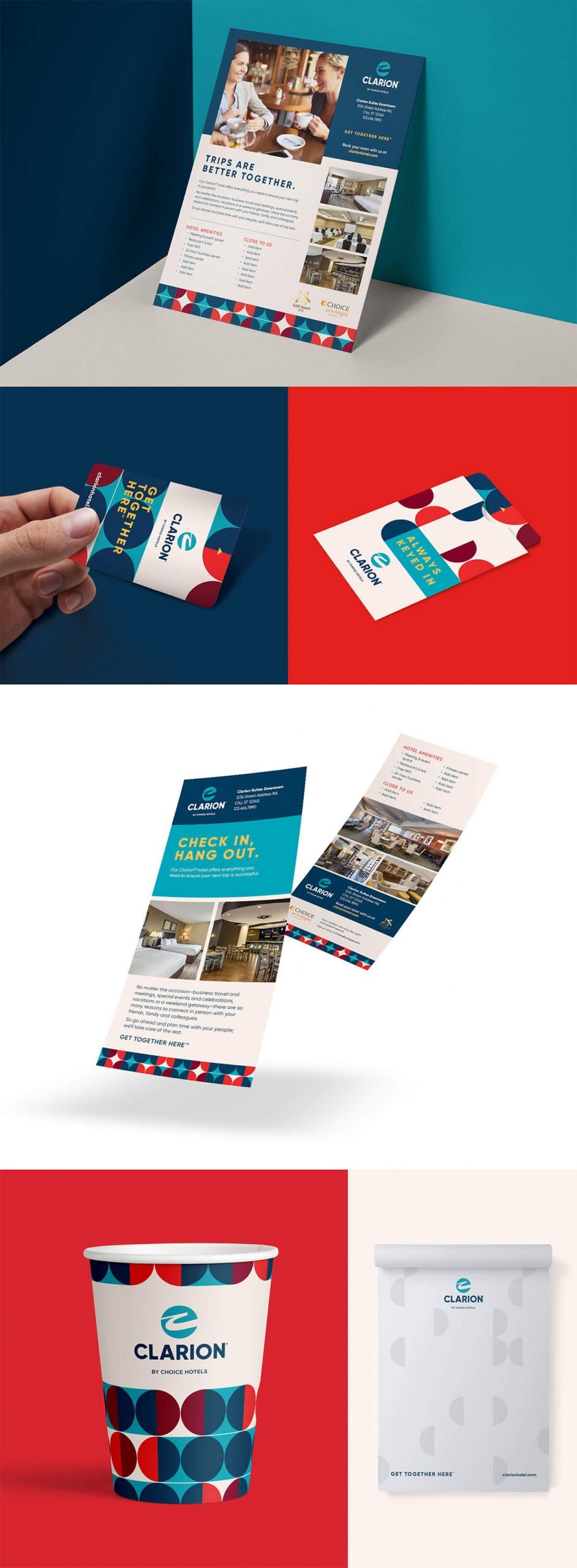
The Clarion hotel brand is ubiquitous throughout the US and can be found in every state as well as every major and secondary city. The goal was to refresh the look and feel of the brand’s marketing to reflect that, although that the brand is everywhere and has been for some time, the hotels themselves are not dated and haven’t stopped modernizing.
CHALLENGE
Refreshing a brand that everyone knows and that has recall as high as Clarion is a challenge in and of itself. To create something that retains certain defining markers yet makes a clear and distinctive turn from its past requires consideration of many factors, including how both hotel owners and consumers will react to the changes.
SOLUTION
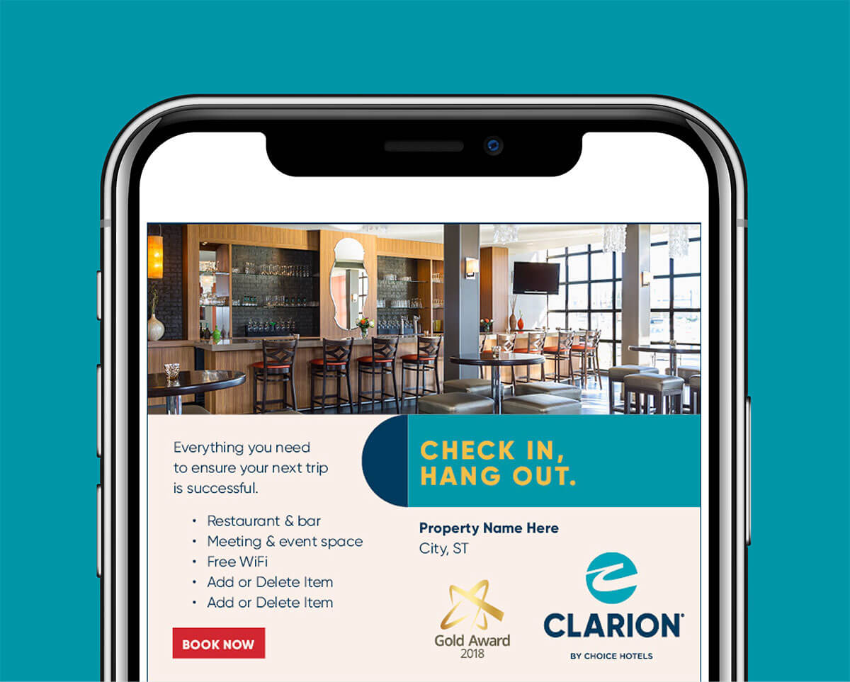
nm+u retained the original brand icon but chose a new, cleaner, more modern typeface for the logotype. The pattern was created as a way to utilize the existing maroon and yellow colors but to add to the palette vibrant reds and teals to liven it up. This pattern also creates a cohesive, yet not static way of connecting all elements together across a host of items.
Design
Cras volutpat, ipsum a dignissim pulvinar, turpis nulla egestas turpis, sit amet cursus diam nunc a neque. Maecenas ultrices molestie accumsan. Vivamus pretium vulputate massa, in venenatis mauris elementum eget. Class aptent taciti sociosqu ad litora torquent per conubia nostra.
+ DIGITAL
+ PHOTOGRAPHY
