Project Description

CLARION POINTE® BY CHOICE HOTELS: BRANDING
BRIEF
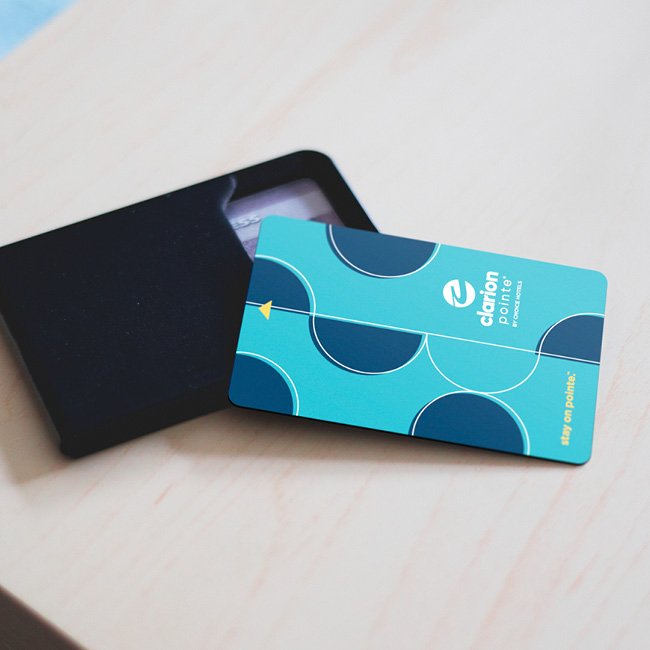
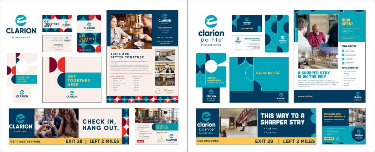
The Clarion Pointe brand is a new off-shoot of the heritage Clarion brand. With more simplified, modern interiors and efficient, contemporary appointments and amenities, the Clarion Pointe brand needed to reflect its connection to the newly updated Clarion brand, while clearly differentiating itself and it’s pared down nature to consumers.
CHALLENGE
Having recently completed a rebranding of the Clarion brand, the goal was be close enough in to the origin brand that it shared in its reputation, yet distant enough that it was clearly a new expression of the brand and not an extension of the original. These considerations were key in the development of both logo and branding identity.
SOLUTION
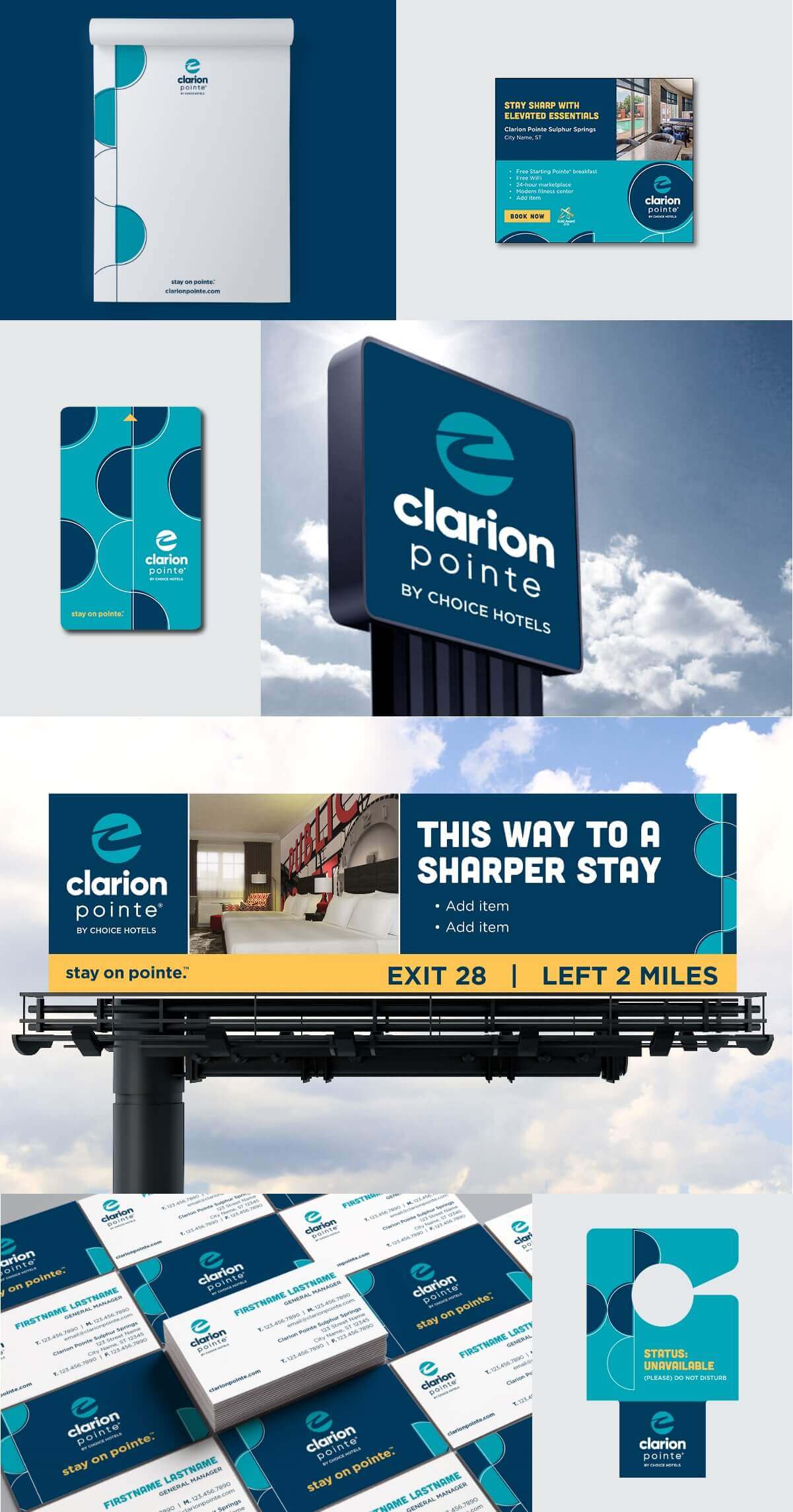
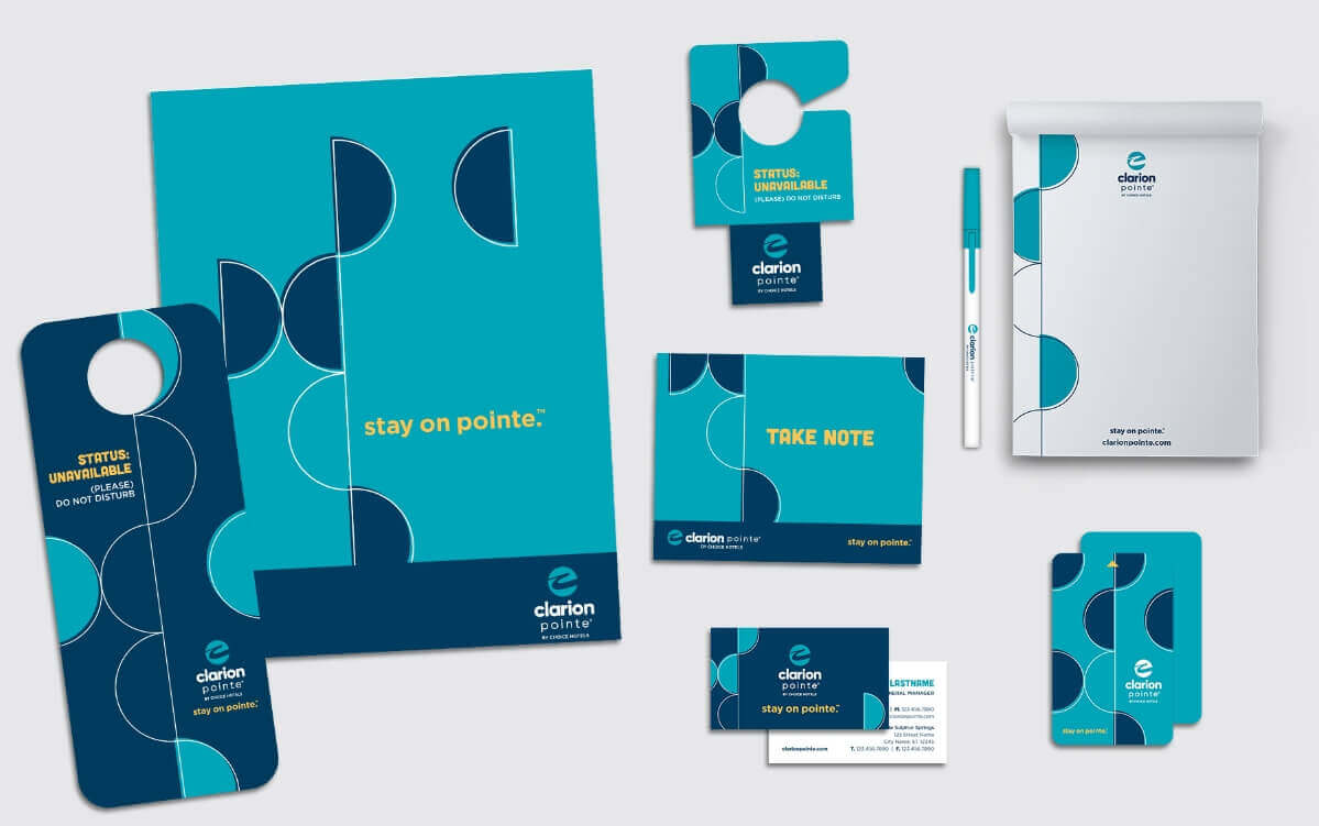
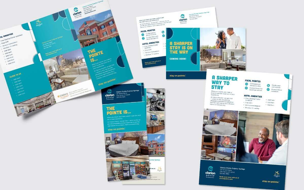
nm+u leveraged, modified, simplified and updated elements from the new Clarion brand to create a more streamlined version. New messaging, new fonts, new photos were employed to clearly differentiate the two brands. Subsequently, this new brand also launched an internal breakfast program which nm+u named, designed, wrote for, and created to roll out along with the brand.
+ CLARION
+ CLARION POINTE
+ LOGO DEVELOPMENT

+ BRANDING
+ HOTEL TOUCHPOINTS
+ MARKETING COLLATERAL
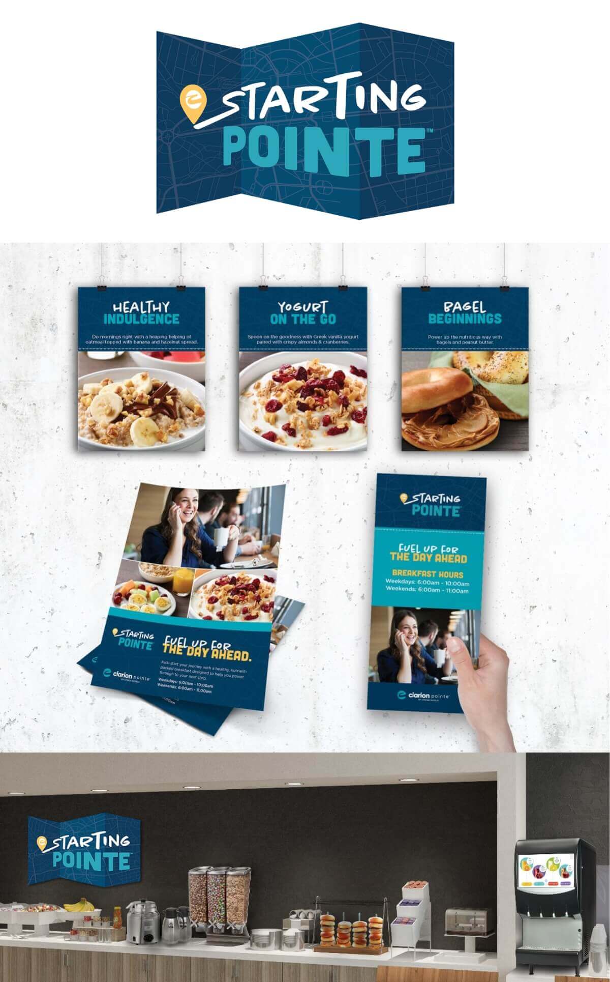
+ STARTING POINTE BREAKFAST PROGRAM
To accompany the launch of the new brand would be a brand new breakfast service at each hotel. From identity to copywriting to environmental signage, the goal was to “fit in” with the themes present in Clarion Pointe, while standing alone as it’s own program.
