Project Description
PROJECT / Rebranding
Project Description
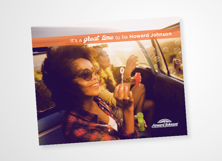
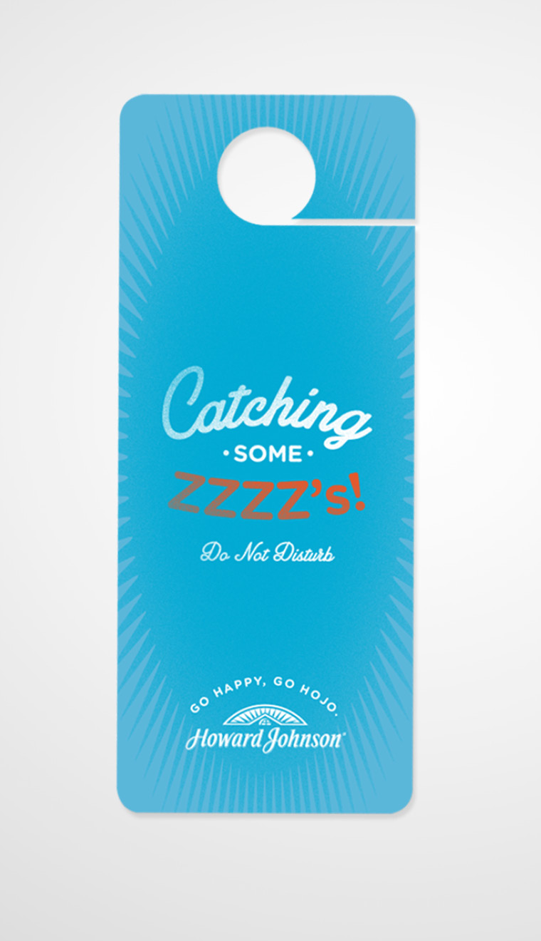
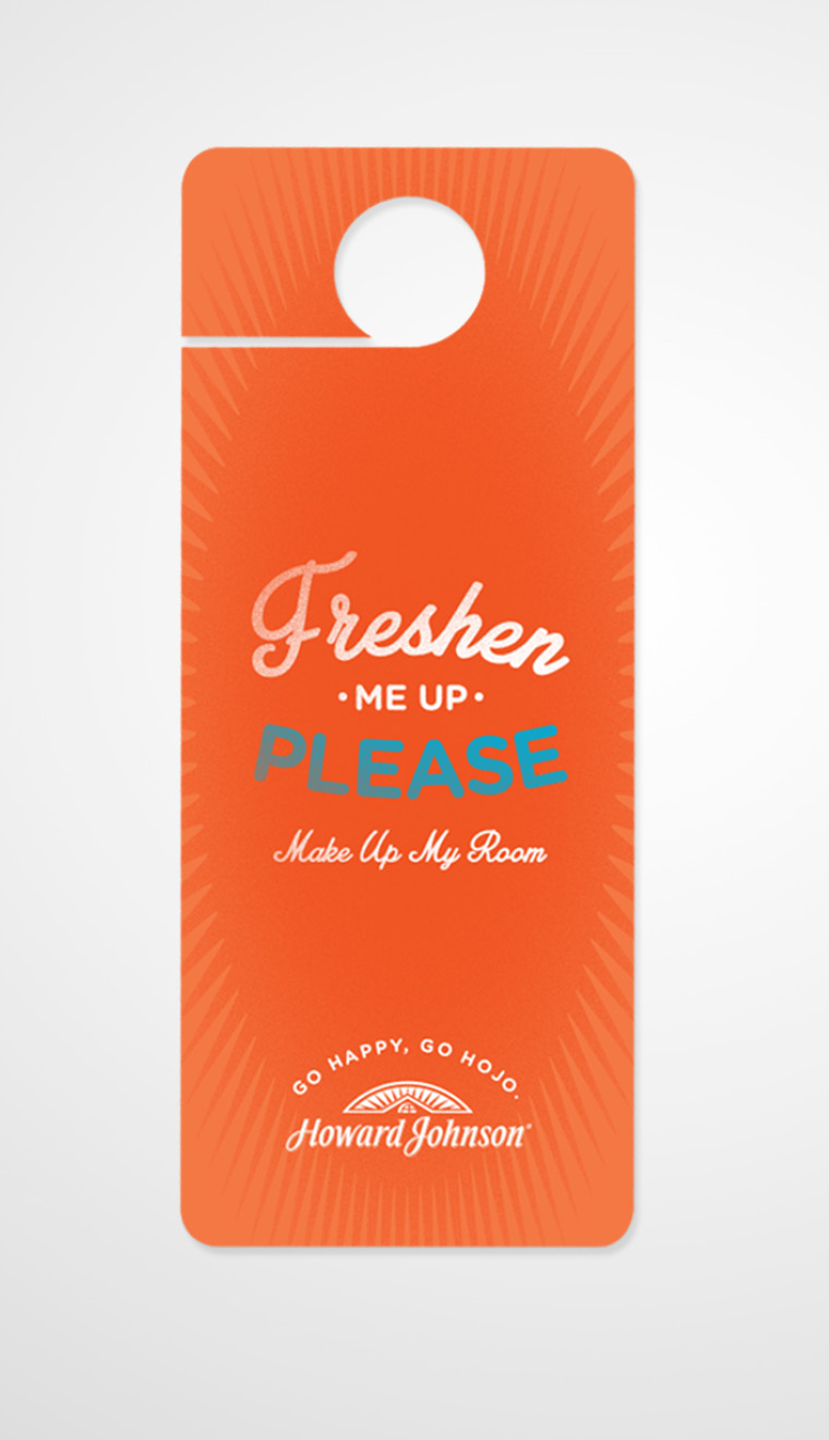
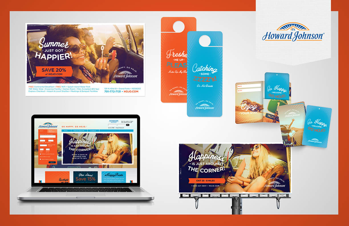
Howard Johnson, an established economy hotel chain with over 400 properties around the world, tapped nm+u to undertake a comprehensive visual refresh to better align its “Happy” positioning with its original roots and heritage as a roadside hotel brand while elevating the overall sophistication of the brand.
Approach:
The agency conducted a comprehensive discovery exercise to identify key elements from Howard Johnson’s heritage and value proposition as well as opportunities for differentiation within the competitive set.
Outcome:
- The new Howard Johnson brand feels true to itself, is contemporary and sophisticated while still appealing to the road traveler.
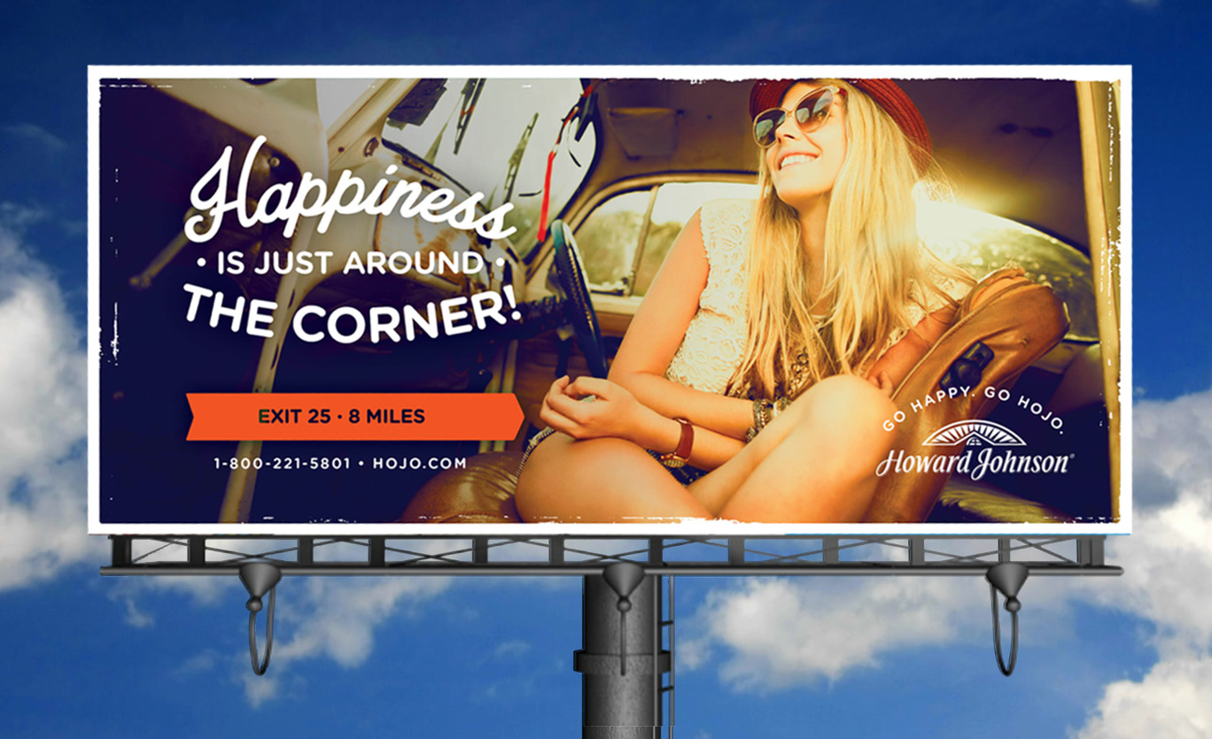
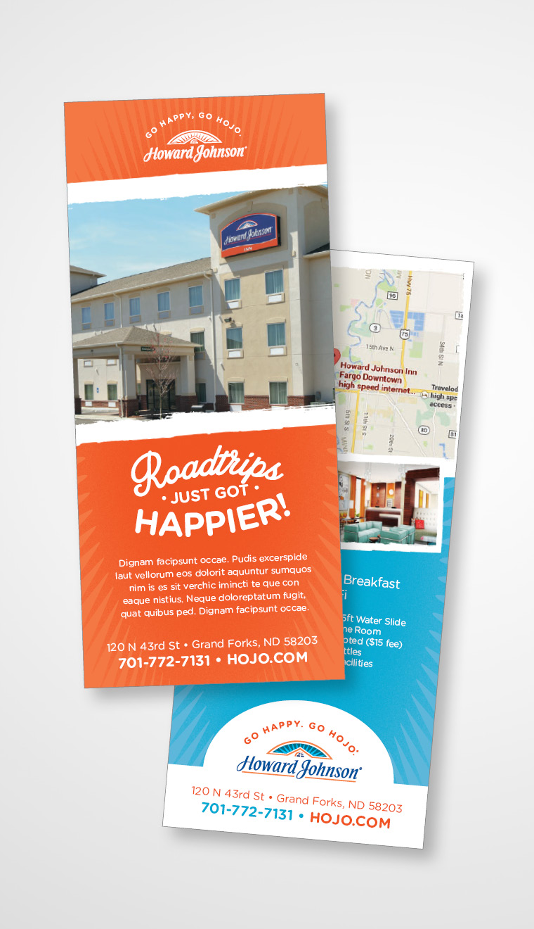
- The brand’s blue and orange color palette was leveraged in order to maintain the “happy” attribute of its positioning.
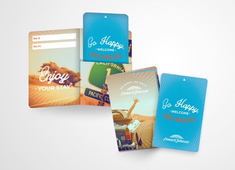
- A unique visual style was developed using elements that pay homage to the brand heritage.
Deliverables Included:
- Overall brand look and feel
- Comprehensive advertising template library: print and digital
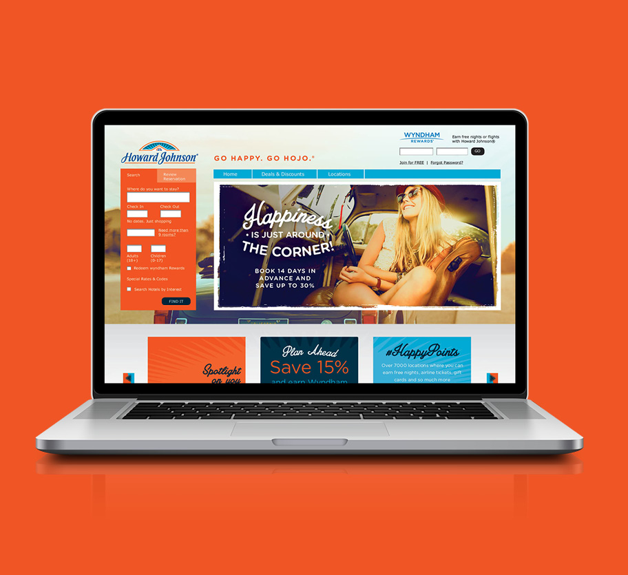
- New website user interface re-skin
- Comprehensive in-house collateral materials library
Conceptual Design Samples
