Project Description
PROJECT / Rebranding
Project Description
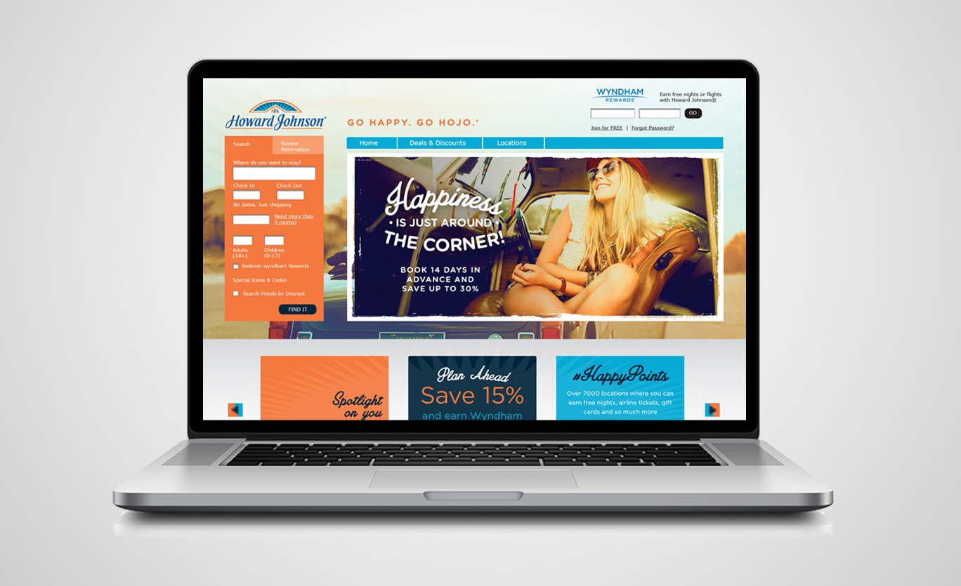
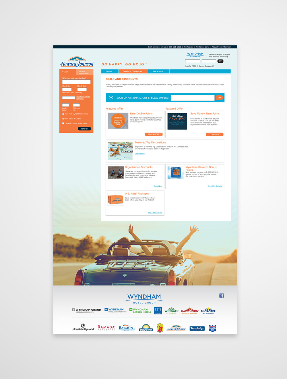
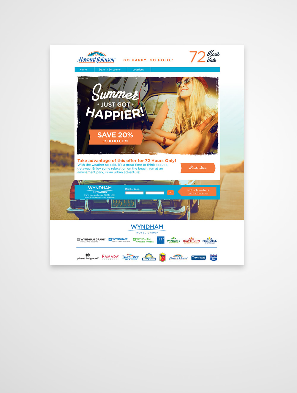
nm+u was tasked with a comprehensive user experience revamp and re-skin of the Howard Johnson website.
- Part of the comprehensive brand refresh for the HoJo brand.
- End result closely aligns the website with the rest of the brand.
- Maintains the brand’s “happy” positioning and appeal to road trip travelers while elevating the brand.
Design Sample Details
