Project Description

SLEEP INN BY CHOICE HOTELS: BRANDING
BRIEF
Refresh existing logo/brand identity for “Sleep Inn” that leverages Sleep Inn’s value proposition as a new-build hard spec brand. Ensure new identity works in the following types of applications: Exterior signage – both for use in monument-type signs and on-building/welcome wall applications and small format digital and print.
CHALLENGE
To create a fresh new brand identity that remained true to the brand’s existing nature-inspired zen feel while also bringing the brand into a more modern and fresh space. Additionally, nm+u was asked to keep the color purple and yellow to retain brand recognition.
SOLUTION
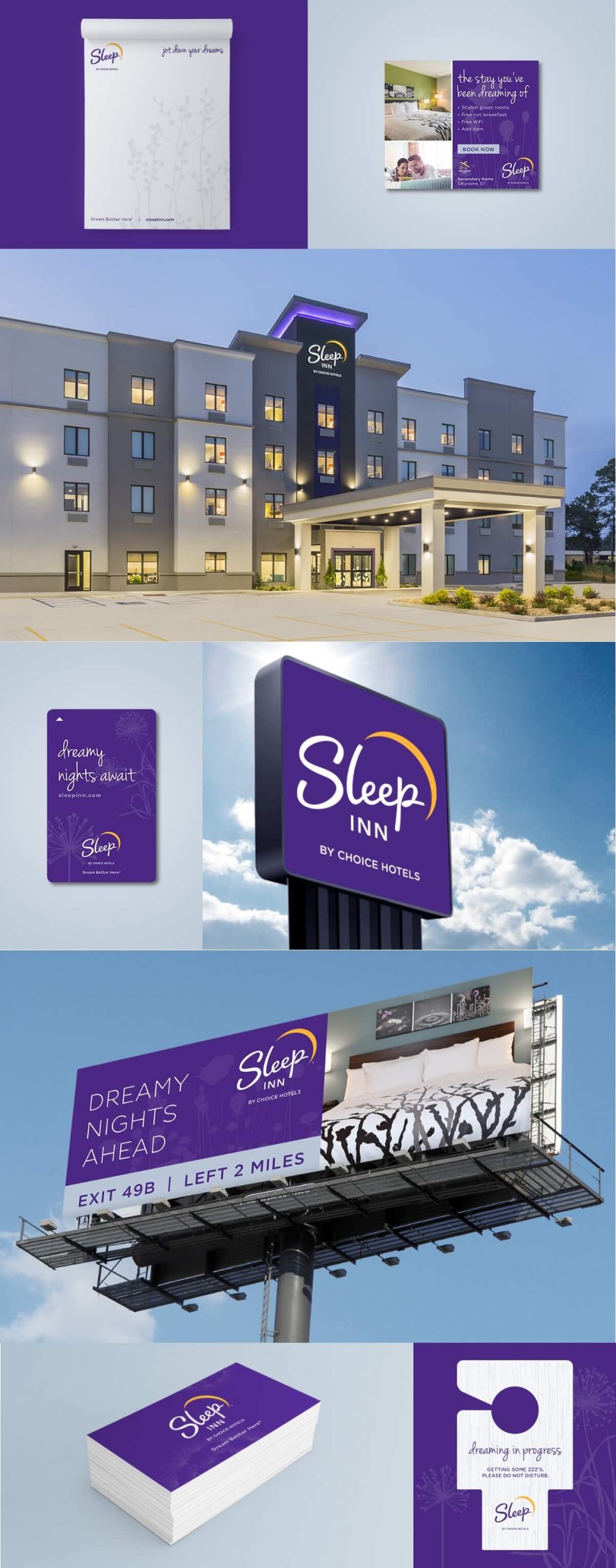
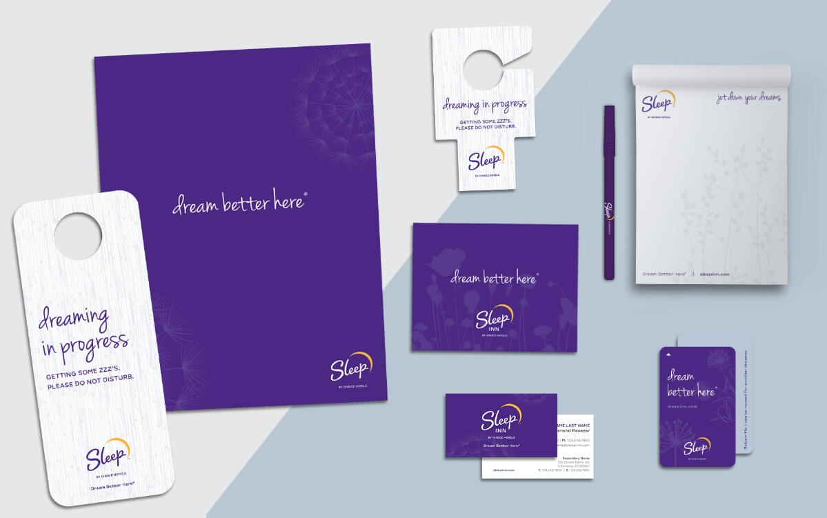
The redesigned Sleep Inn logo provided the base for a refreshed color palette, and a balance of clean modern elements with organic shapes and dynamics. These themes and palettes would play out through all communications and collateral.
+ LOGO
Sleep Inn’s new logo is an inspired update to their previous, keeping the concept of the yellow moon and introducing a hand drawn type for the word “Sleep”. Nature graphics and colors were an important aspect of the updated design so that it lives cohesively with the existing on-property interior design.

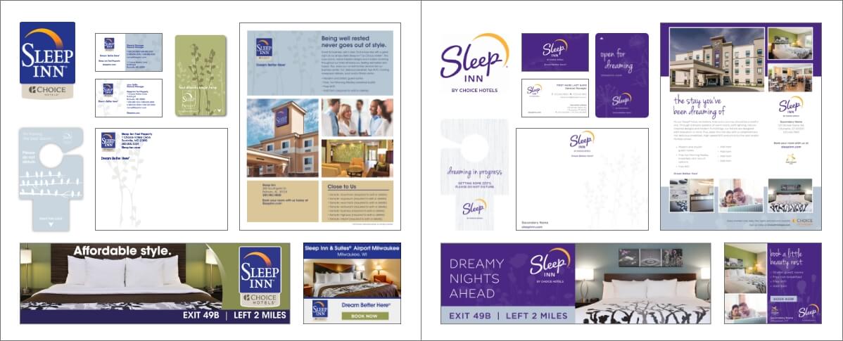
+ BEFORE
+ AFTER

+ BRANDING

+ HOTEL TOUCHPOINTS

+ MARKETING COLLATERAL


